Why Paper Grain Changes a Pencil Line
Why paper grain changes a pencil line: learn to read tooth, pressure and graphite response so you can choose paper for the marks you want.
The common mistake with pencil paper is judging it by smoothness alone. A surface that looks neat under a shop light may make a line feel slippery, while a visibly rough sheet may catch the pencil so strongly that small details become awkward. Understanding why paper grain changes a pencil line helps you choose by the marks you want, rather than by a vague ranking of paper quality.
What does paper grain mean for a pencil line?
Paper grain, in drawing, usually refers to the texture of the sheet’s surface: the tiny rises and hollows that meet the pencil point. It is also called tooth. This drawing sense of grain is different from the direction of fibres within a sheet, which matters more for folding and handling.
Graphite does not simply sit as an even film on paper. The point touches some parts of the surface more than others. On a textured sheet, the raised areas take graphite first, while the hollows may remain pale. The resulting line can look broken, grainy or softly shaded, even when the hand moves steadily.
On smoother paper, the point meets a more even surface. A fine line can appear continuous, and small changes in pressure may read clearly. But smoothness can also make a mark feel slick or faint, especially if the pencil’s graphite does not catch readily.
Texture is not a defect to be removed. It is part of how the paper translates a hand movement into a visible mark. The useful question is whether that translation suits the drawing.
How does paper texture change the look of graphite?
Texture affects several qualities at once. It changes how dark a stroke appears, how evenly it fills an area, and how much of the paper remains visible through the graphite.
- Line continuity: A rougher surface can interrupt a light stroke, leaving tiny gaps. A smoother surface tends to support a more even line.
- Edge character: A soft pencil on textured paper may produce a slightly ragged edge. On smooth paper, the same pencil can make a more controlled, crisp-looking boundary.
- Tonal coverage: A broad side stroke can leave pale flecks where graphite has missed the hollows. More rubbing or layering may make the tone look fuller, though it can also flatten the surface character.
- Visible paper: The sheet’s texture can remain legible through a mark. That can add liveliness to a shaded passage, or compete with a delicate subject.
Pencil grade matters too. A harder pencil often makes a lighter, narrower mark and may show the surface’s interruptions clearly. A softer pencil deposits more graphite, which can cover some texture but may also emphasise it through darker deposits on raised areas. Pressure, point sharpness and stroke direction all alter the result.
Does smoother paper always make better pencil drawings?
No. Smooth paper is useful when the drawing depends on fine edges, small features or restrained shading. It may suit tightly observed details and clean line work. Yet it can be less forgiving if you want a visibly lively stroke or a shaded area with the paper’s tooth showing through.
More textured paper can give a line a broken, tactile quality and help a broad pencil stroke carry variation. It may suit loose studies, expressive marks or drawings where the surface is part of the image. The trade-off is that tiny details can be harder to keep clean, and a pale line may look uneven.
Neither surface is inherently superior. “Better” depends on the intended mark, the pencil in your hand and the amount of control you want. A sheet that frustrates one drawing may be exactly right for another. Paper descriptions such as smooth, medium or rough are useful starting points, not promises of a particular result.
How can you compare papers by observation?
Compare sheets with the same pencil and a few repeated marks. The aim is not to crown a winner in the abstract. It is to notice which surface gives you the most useful response.
- Choose two or three papers with visibly different surfaces. Use offcuts or sample sheets if available, and place them beside one another.
- Make a light line on each with the same sharpened pencil. Keep the hand movement and pressure as similar as you reasonably can.
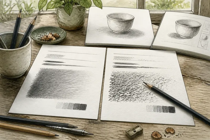
- Draw a darker line beside it, then add a small patch of side-shading. These marks reveal different aspects of the surface.
- Look closely at the light line. Notice gaps, edge roughness and whether the graphite appears to sit evenly.
- Compare the shaded patches from arm’s length and up close. Observe how much paper shows through and whether the tone looks lively, patchy or smooth.
- Try one short line across the first marks. Notice whether the pencil glides, catches or feels difficult to steer.
- Write a brief note beside each sample, such as “clean fine line, weak broad tone” or “grain visible, soft edges”. Choose according to the drawing you expect to make.
Say you are choosing paper for a drawing of a small ceramic cup, and you want a clear rim with soft shading beneath it. You compare two offcuts using the same HB pencil: on one, the rim line stays crisp but the shaded patch looks thin; on the other, the shading has more visible grain but the rim edge breaks slightly. The first sheet may better serve that particular drawing, while the second could suit a looser study of the cup’s shadow.
This is an observation, not a laboratory comparison. A different pencil, sharper point or firmer hand could change the result. Keeping the marks simple makes the differences easier to see without pretending that the papers have a single fixed character.
Which pencil marks should you use to judge a sheet?
Use marks that resemble the work you plan to make. A single line tells you little about how a sheet handles shading, and a shaded patch says little about tiny contours. A useful comparison includes at least a fine line, a firmer line and a small area of tone.
For delicate outlines, test a light stroke and a curved line. For broad shading, use the side of the pencil and watch whether the texture reads as an appealing variation or a distracting speckle. If you rely on repeated layers, add a second pass over part of the patch and see whether the result becomes smoother or simply darker.
Keep the pencil grade consistent across papers during the comparison. Then, once a surface seems promising, try the grade you normally use. That second look tells you how the paper and your usual tool work together, rather than how the paper behaves in isolation.
Why does the same paper feel different with another pencil?
The pencil point and its graphite mixture affect how it meets the surface. A hard point can skate over some textures, leaving a fine, pale mark. A softer point may catch on the raised parts and lay down more graphite, making the stroke darker or more visibly broken.
Sharpness changes contact as well. A freshly sharpened point can reach into small hollows and make narrow marks. As it wears, the contact area broadens, which can produce heavier strokes and more apparent texture. Pressure adds another variable: pressing harder may darken a line, but it can also make the mark less easy to lift or revise.
When a mark looks wrong, do not immediately blame the paper. Try a different pencil grade or point shape on a spare area. If the line becomes easier to control, the mismatch may have been between tool and surface rather than a flaw in either one.
What should you check before choosing drawing paper?
Start with the work rather than the product description. Consider whether you need crisp contours, soft shading, visible surface character or room for repeated pencil layers. Then inspect the sheet under ordinary light and make a few marks, if a sample is available.
Check how the surface responds to the pressure you naturally use. Notice whether light marks remain legible, whether darker areas fill evenly enough for your purpose, and whether the pencil feels easy to guide. These observations are more useful than choosing the smoothest or roughest option on principle.
For a drawing that combines precise detail with broad tone, a middle-ground texture may be a sensible place to begin. It can offer some grip without making every small line visibly rough. But the label is only a clue; manufacturers describe surfaces differently, so judge a sample when you can and follow any product guidance that affects its intended use.
Paper grain changes a pencil line because the surface takes part in making the mark. A short comparison with familiar strokes can show whether that grain supports the drawing’s edges, tones and pace. Keep the sample notes: they turn “this paper feels nice” into a more useful decision about what your pencil can do on it.