A Small Exhibition: Give Each Work Some Breathing Room
Small exhibition spacing helps visitors see each work clearly. Arrange for sightlines and viewing pace, so a modest display feels deliberate, not crowded.
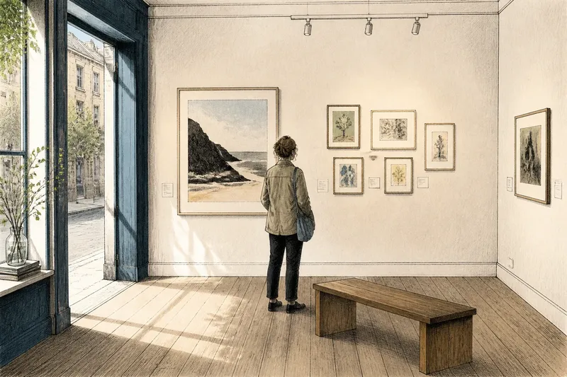
The common mistake in a small exhibition is to fill every available patch of wall. It costs each work attention: viewers cannot tell where one piece ends as an experience and the next begins. Small exhibition spacing is not a matter of obeying a fixed gap. It is the decision to give visitors enough room to look, move and change focus.
A modest display might occupy a front room, a shop window or a short stretch of corridor. Its size does not decide how crowded it feels. The relationship between the work, the viewing distance and the route through the space does. Start by asking how people will encounter the pieces, rather than by drawing a pleasing grid.
Choose spacing by the way visitors will look
Stand where a visitor is likely to enter. Notice which work catches the eye first, what sits beside it, and whether another piece competes for attention. A wall label, a doorway or a bright window can act as visual material too. The display is more than its frames.
For intimate work, closer spacing can make sense. Small drawings, delicate prints and pieces with related details may reward comparison at short range. Leave enough visual separation that their edges and labels do not merge. For work that asks for a longer look, a larger interval gives the eye a place to pause before moving on.
Do not use equal gaps simply because equal gaps are easy to measure. A cluster can be tight and still legible if its works clearly belong together; a single work may need more space because it carries the room’s first impression. The useful test is whether a viewer can recognise the grouping and then look at each piece without having to untangle the arrangement.
Let the room decide the viewing distance
A narrow passage encourages people to keep moving. A room with a bench or an open central area invites them to stay. Arrange accordingly. In a passage, keep the display visually simple and allow enough room for someone to stop without blocking everyone else. In a room where visitors can linger, pieces can ask for closer inspection, provided there is a comfortable place to stand back.
Look at the work from several ordinary positions: the entrance, the likely stopping point, and the place where someone might turn towards the next wall. A grouping that looks balanced from one spot may become a tangle from the doorway. Sightlines are not an abstract design concern; they are what a person can actually see without leaning around a door or stepping into another visitor’s path.
Consider glare and reflections as part of those sightlines. Glass may catch a window or ceiling light, making a carefully placed image hard to read. A small change in angle or position can help, but do not solve glare by creating an awkward route or placing a fragile work where people brush past it. Follow the maker’s and venue’s guidance for hanging materials and display conditions.
Sort the display by situation, not by a standard layout
If visitors pass through quickly, favour a clear sequence with an obvious starting point and few competing clusters. Use larger or more immediately legible works where they can be seen from the approach. Keep detailed pieces where a visitor can safely stop. This suits a corridor, a reception area or a busy shared venue because people can grasp the display without having to reverse direction.
If visitors can pause, allow more variation in spacing and scale. A close group can reward comparison, while a nearby work with a different mood gives the eye a reset. This suits a quiet room or a small gallery with room to stand back. The visitor has time to notice the relationships, rather than receiving every piece at once.
If the works differ greatly in size, arrange them around how they read at viewing distance, not around a common top edge. A small work may need clear space around it to remain visible beside a large one. Keep the smaller piece where people can approach, and avoid making the larger work a visual wall that hides what follows. This fits a mixed display where scale is part of the contrast, not an inconvenience to conceal.
If the room has one dominant entrance or window, treat that feature as the display’s opening view. Place the most useful point of entry where it can be seen, then check what the visitor notices next. This suits rooms with a strong architectural feature because the display can work with the existing sightline instead of fighting it. A dramatic window, however, may also wash out or reflect work, so the best-looking position on paper may be a poor one in daylight.
Say you have a narrow community-room wall, a large print and several small studies. You might place the print where it is visible from the doorway, then group the studies close enough to invite comparison but not so close that their frames touch. From the entrance, the expected observable result is a clear first view; from nearer the wall, the studies should read as separate pieces. If either view fails, move the group and check again rather than adding more work to fill the wall.
Use a simple rehearsal before hanging
Make paper shapes that match the works’ outer dimensions and mark their titles on the back. Low-tack painter’s tape can hold them temporarily if the surface allows it; test the tape somewhere discreet first. This lets you compare arrangements without repeatedly lifting framed work or committing to holes.
Walk the route as a visitor would. Check the view from the entrance, the distance at which a person naturally stops, and whether another person can pass. Look for a visual rhythm: a moment of focus, a pause, then a reason to continue. The rhythm need not be uniform. A display can slow down around one demanding work and move more briskly through a related group.
- Check that each work can be seen from the intended stopping place; if not, change its position or the route.
- Check that labels are close enough to their works to be understood, but do not interrupt the image or surface.
- Check that frames and edges do not collide visually; if they do, widen the gap or separate the group.
- Check the entrance view for a clear point of attention; if everything shouts at once, remove or relocate a piece.
- Check for glare and reflections at different times or under the venue’s usual lighting; if they obscure a work, consider another position.
- Check that visitors can stop without blocking a doorway, route or access point; if they cannot, simplify the display or alter the viewing position.
Answer the practical questions before opening
How much space should go between works?
There is no useful universal gap. Begin with enough separation for each work’s edge and label to remain distinct, then adjust for scale, grouping and viewing distance. The right spacing is the one that makes the relationship legible without making neighbouring pieces compete.
Should every work be hung at the same height?
A consistent visual line can help a compact display feel calm, but a rigid line can make works of different sizes awkward to read. Set the arrangement for the people who will view it and the positions they can comfortably take. If the room or venue has hanging rules, follow them.
How do I arrange work on a narrow wall?
Prioritise a clear view from the approach and avoid making visitors step backwards into a route to see the whole display. A compact group may fit better than a line of isolated pieces, especially when the works relate. Keep any small or detailed work where a viewer can stop safely and get close.
What should I do when the room feels crowded?
Remove a piece before reducing every gap. Fewer works can give the remaining ones a stronger, clearer presence, while a dense wall often leaves visitors with no natural place to begin. If removal is not possible, reconsider which works belong together and whether the route can be made more direct.
Leave room for movement as well as looking
Spacing is partly a courtesy. A visitor should not have to reach across someone else, squeeze past a display edge or step into a doorway to get a better view. In a shared venue, consider coats, bags, chairs and the everyday movement of staff. These are not interruptions to the exhibition; they are the conditions in which it exists.
Small exhibition spacing works best when it responds to the actual room and the likely pace of its visitors. Before opening, make one final pass from the entrance to the last work. If the display offers a clear first look, room to pause and a sensible way onward, resist the urge to fill the remaining wall. Empty space is not a missing exhibit. It is where the viewer’s attention can settle.