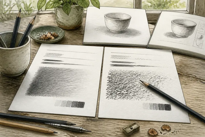
The Myth of the Matching Set
The matching art supplies myth can make a kit look tidy but less useful. Choose tools for the work, and keep only the uniformity that helps.
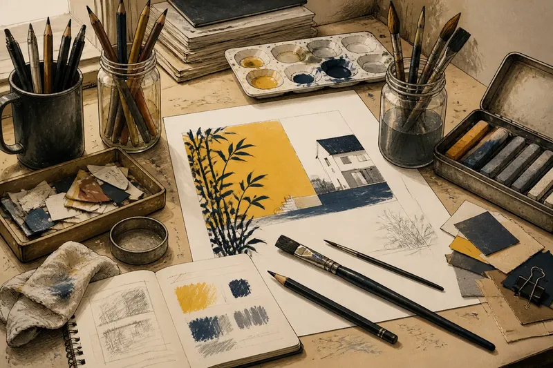
The matching art supplies myth is easy to buy into: a neat row of identical brushes, a coordinated set of pencils, paper that all comes from one pad. The cost is often a tool that looks right in the drawer but is wrong for the task. Materials do not need to agree visually to work well together.
A useful kit is a collection of choices, not a display. These seven decisions help separate practical compatibility from the pleasant but largely decorative idea of a matching set.
1. Choose each tool for its job
Start with the action the material needs to perform. A broad brush lays in a wash; a small round brush can carry a narrower line; a worn brush may be useful for dry texture. There is no particular virtue in owning a complete run of brushes if only a few shapes suit the work.
The same applies to pencils. A hard grade can keep a light construction mark restrained, while a softer grade gives a darker line without leaning on the point. A mechanical pencil may suit repeated fine marks; a wooden pencil is easier to alter quickly with a sharpener. Their matching labels matter less than what your hand can do with them.
Say you are making a small poster with a large flat shape and several fine details. You might choose a wide brush for the shape, a liner brush for the edges, and a pencil for the initial placement, even if none came in the same set. The expected result is that each part can be made with a tool suited to it, rather than forcing one brush to imitate three.
2. Match materials by behaviour
Visual uniformity is a weak guide to compatibility. More useful questions are whether the materials accept one another, dry at a workable pace, and produce the surface you want. A water-based marker and a wet wash, for example, may interact differently from a waterproof ink and the same wash. The first pair may soften or spread; the second may keep a firmer boundary.
That difference is not automatically a defect. It is a choice about the mark. If a material lifts, feathers or resists another layer, decide whether that behaviour belongs in the piece before building a large area around it. Small scraps are a practical place to check how combinations behave.
Labels and manufacturer instructions matter where they describe compatibility, preparation or safe use. Follow them for the products in hand, rather than assuming that items from one brand or colour family are interchangeable.
3. Keep a working palette, not a complete colour family
Colour sets encourage the hope that every shade will be useful. In practice, a smaller working palette can be easier to understand. Choose colours for the relationships the work needs: a warm and cool option, a dark for contrast, and a light or uncoloured material for preserving open space. The exact selection depends on the subject and medium.
There is no requirement for paints, coloured pencils and paper to share a manufacturer. A particular blue may be pleasing in one medium and muddy in another. A sheet of coloured card can serve as part of the image rather than an inconvenient mismatch. Make decisions from the mark and surface in front of you, not from the packaging.
When a colour matters, keep a small swatch beside the work. Note the medium and any layer beneath it. That record is more useful than relying on a cap or wrapper, which may suggest a colour but cannot show how it appears on your chosen surface.
4. Let surfaces vary when the work benefits
Using one surface for every task is tidy, but it can make the surface dictate the method. A smooth sheet may suit crisp ink lines. A more textured sheet may give a dry medium a broken edge. A prepared panel may take a different kind of mark from either. These are not interchangeable foundations, and they need not be.
For a piece that combines drawing and collage, different stocks may even help distinguish the layers. The decision is not to add variety for its own sake. It is to ask whether the surface supports the intended mark and whether its change is legible as part of the work.
One practical limit is handling. If an element needs to be cut, folded or attached, consider whether the material will tolerate that action. A beautiful stock that buckles under the chosen adhesive can turn a simple composition into an exercise in negotiation.
5. Replace tools selectively
A coordinated set often makes replacement feel like a single decision: buy the same set again or leave it incomplete. Neither is necessary. If one brush has worn down, replace the brush that serves that function. If a favourite pencil is nearly finished, a similar grade from another maker may do the job; check its mark on your working surface rather than expecting an exact twin.
Keep useful oddments. A short pencil is still useful if it can be held comfortably. A chipped pastel may make a broad mark that its intact neighbour cannot. A small jar with a secure lid can hold a modest quantity of water or medium without completing a matching collection of containers.
Discard or set aside materials that are damaged, unpleasant to handle or unsuitable for their intended use. Sentiment is not a storage system, although it does occasionally dress like one.
6. Make storage serve the working sequence
Matching containers can look orderly while making the tools harder to reach. Group materials by what happens during a session: drawing tools together, wet media together, cutting tools in a separate place. A pencil tin, jam jar for brushes, lidded box for pastels and recycled tray for scraps can coexist without confusing the work.
Consider what needs protection. Brushes should not be stored with their bristles crushed. A pastel that sheds dust may need a container that keeps residue away from clean paper. Small blades and other sharp tools should be stored safely, not loose in a pleasingly assorted pot. For safety-critical handling or storage, follow the product instructions and relevant local guidance.
Visible, reachable tools are easier to choose than a set buried beneath its own packaging. The aim is not to make storage look improvised. It is to make the next useful action obvious.
7. Spend attention on the work, not the kit’s appearance
A matching set can be comforting. It gives a beginner a bounded choice and can simplify buying when the options feel bewildering. That is a reasonable convenience, not a rule about how a studio must look. Once you know what a task asks of a material, buying the whole family may add duplicates rather than capability.
Before adding another coordinated set, name the problem you want it to solve. Do you need a different point, a more absorbent surface, a colour that holds its place, or a container that protects the material? If you cannot name the need, waiting is a sound purchase decision.
What should match in an art kit?
Do art supplies need to be from the same brand?
No. Brand consistency may make replacement or product identification simpler, but it does not determine whether a tool suits a task. Check the material’s behaviour and the maker’s guidance where compatibility matters.
How can I tell whether two art materials work together?
Try them on a scrap of the surface you plan to use, in the same order as the intended work. Observe whether one spreads, lifts, resists or changes the other, then decide if that result fits the piece.
Is a complete art supply set useful for beginners?
It can be a convenient way to begin when you are unsure which tools you prefer. Treat it as a starting collection, not a requirement to keep replacing every item as a set.
When is a matching set actually worth choosing?
Choose one when uniform size, shared refills or simpler storage solves a real problem. The reason should be practical; a tidy row can be a bonus rather than the brief.
The matching art supplies myth is easiest to leave behind when you judge each item by the mark, surface or handling it enables. Keep the sets that make a task simpler, and let the rest of the kit look like the work it serves: particular, useful and not obliged to coordinate.